More progress on split-screen revival
Showing more players
I am making good progress so far. As I said before, the game engine is now capable of showing 4 players:
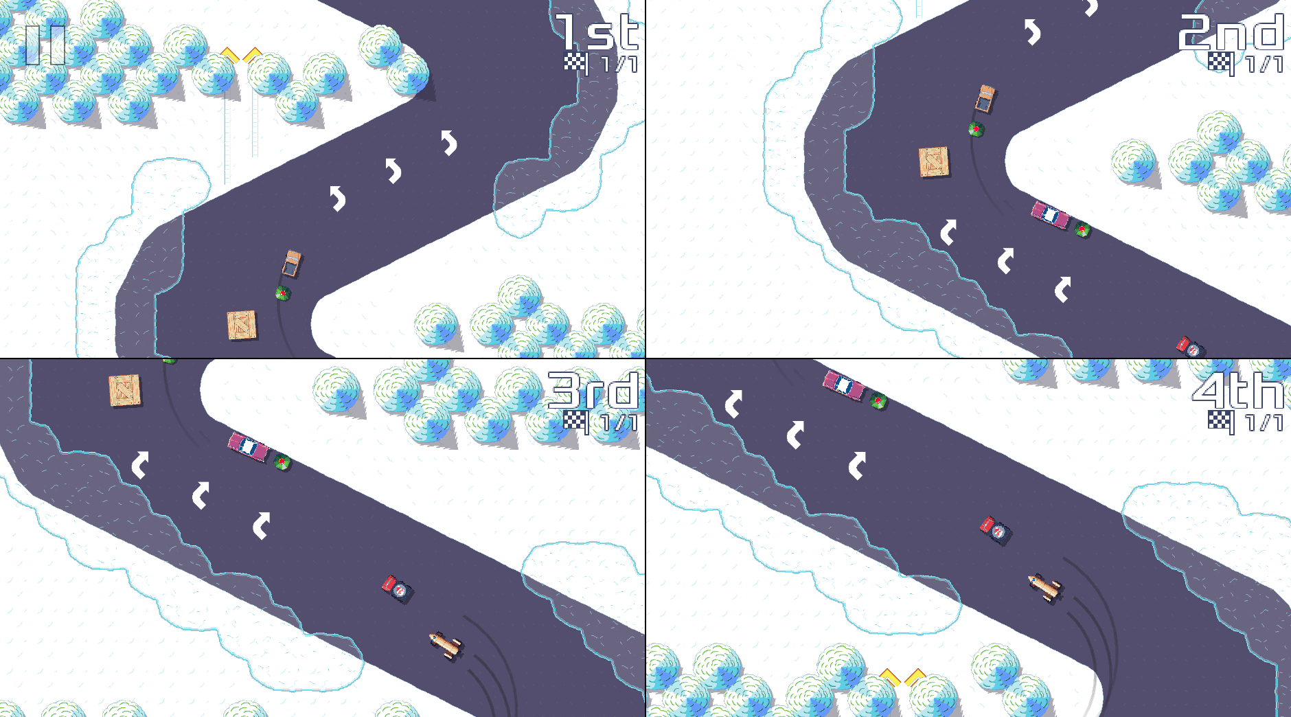
It also now shows a thin black line between player screens to improve readability.
This is not finished though: (more than) half of the battle is reworking the game screens to accommodate up to four players. The above screenshot is a bit misleading: the game engine shows 4 racers, but not all of them are controlled by players yet.
Vehicle selection
One of the challenging parts of this work was the vehicle selection. Until now, in multi-player mode, Pixel Wheels have been showing one vehicle list per player, like this:
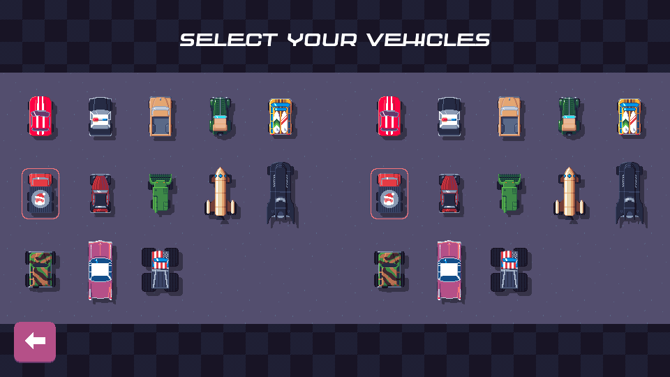
That design does not scale to 4 players: 4 vehicle lists would not fit on the same screen, and even if they did, it would look very cramped. Taking some inspiration from Mario Kart, I reworked this screen to use a shared vehicle list, where each player controls its own selection.
This was tricky to achieve because the code for this selector was not created with multiple players in mind 😅. After much refactoring, I managed to pull this off. It now looks like this:
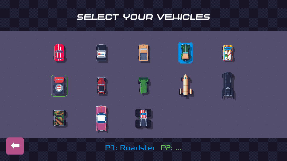
The screenshot shows only 2 players, but it should scale to 4 players without issues.
Not done yet
There is still some work to do before 4-player split-screen is ready though.
First, I need to add a way to select the number of players. This should be easy.
Second, I need to rework the configuration screen to allow configuring the controls for 4 players. I expect that one to be challenging. As you can see in the screenshot below, the current UI does not scale to 4 players, and the UI code currently does not support scrolling pages…
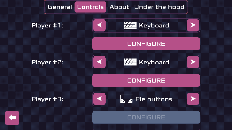
These are the next challenges, once I am done with it, 4-player split-screen should be good to go!
Get Pixel Wheels
Pixel Wheels
Top-down retro racing game for PC (Linux, Intel-based Mac, Windows) and Android.
| Status | In development |
| Author | Aurélien Gâteau |
| Genre | Racing |
| Tags | Arcade, Pixel Art, Retro, Top-Down |
| Languages | English |
More posts
- Pixel Wheels 1.0.0 rc1 is out!Jul 18, 2025
- Pixel Wheels is looking for translatorsJul 01, 2025
- Upcoming new feature: leagues!Oct 10, 2024
- Pixel Wheels 0.26.0 is out!Sep 11, 2024
- New version of Pixel Wheels about to land...Sep 07, 2024
- February 2024 update, smoke!Mar 06, 2024
- January 2024 update, Pixel Wheels new trackFeb 06, 2024
- Pixel Wheels 0.25.0 released!Aug 31, 2023
- Working on a new carJun 10, 2023
Leave a comment
Log in with itch.io to leave a comment.